ALTR
Bom Dia Market
Bom Dia Market
A refined identity for a boutique market
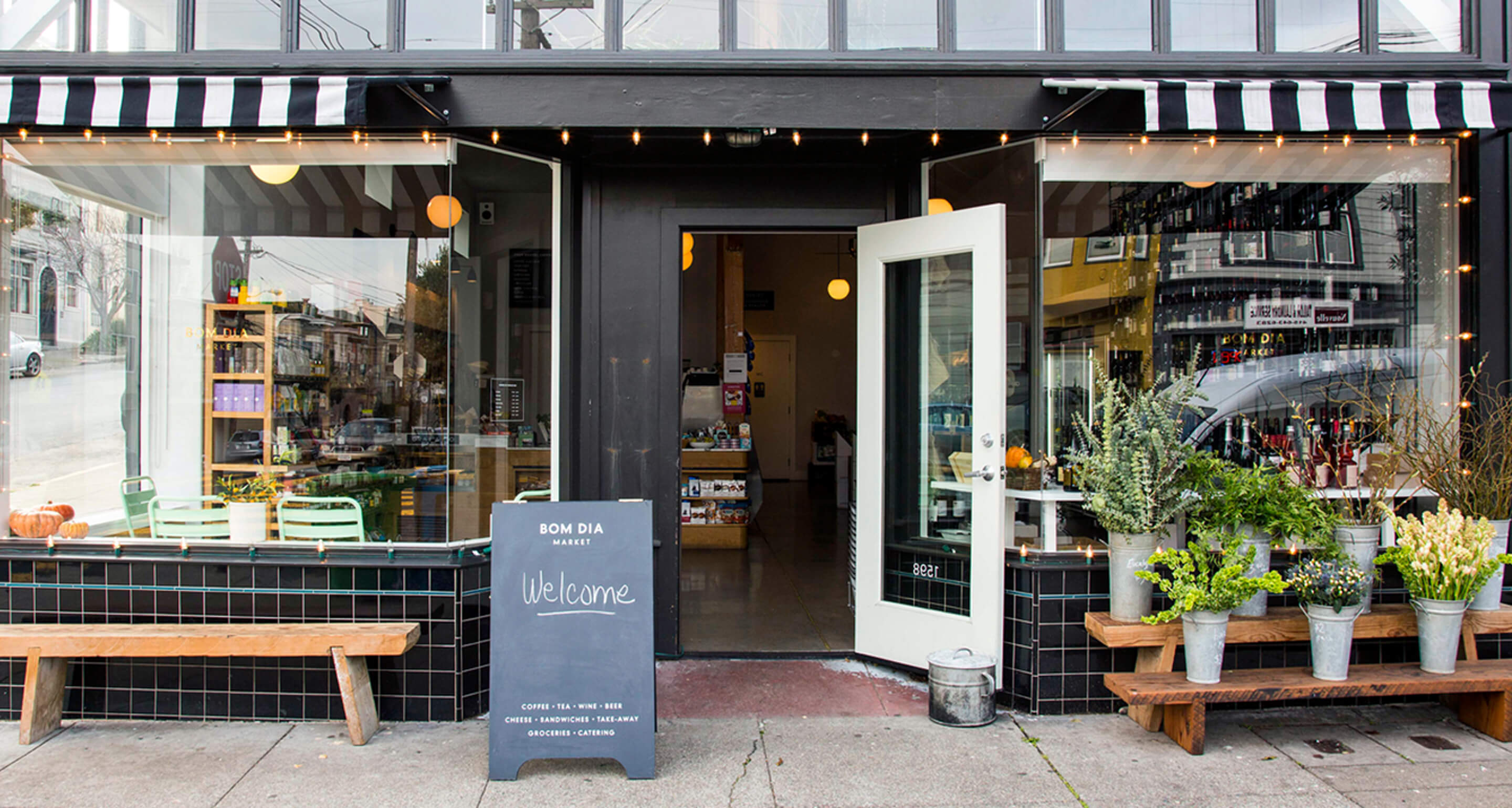
When the owners of upscale corner grocery, Bom Dia Market—Portuguese for good morning—approached us to create a visual narrative we walked up the hill into the affluent Noe Valley neighborhood in San Francisco. Once inside their cozy corner shop, we took in the stunning marble countertops, gold fixtures, globe lights, as well as the fresh flowers, Bay Area coffee brands, racks of wine, and thought: European cafes and food specialty shops. The owners explained their objective was to create a neighborhood hub where locals could stop to chat over coffee in the morning, or grab a house-made meal from their deli case to eat on the wooden benches outside.
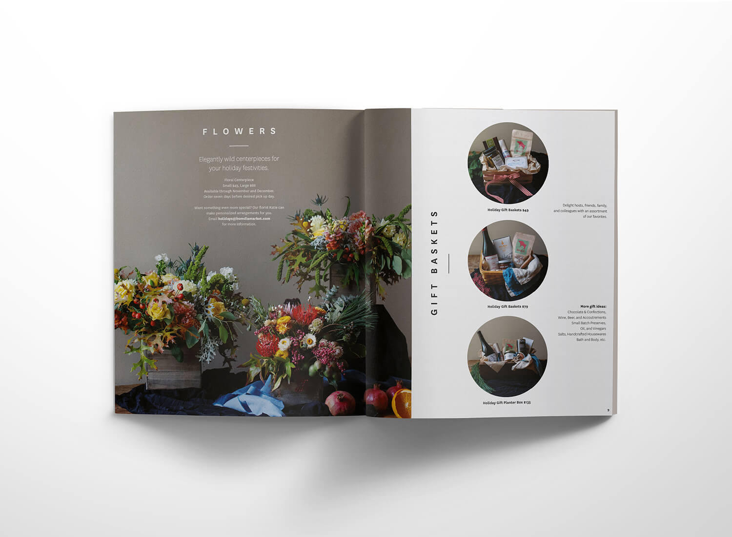
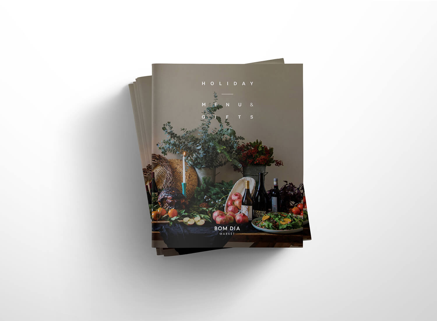
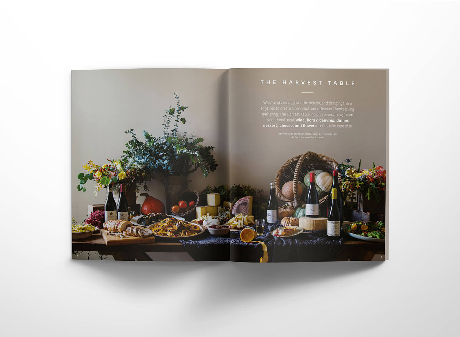
From the start, Bom Dia and ALTR agreed upon the visual aesthetic: clean, classic, black and white. Their entire brand identity—signage, business cards, menus, website, holiday catalogue—was designed to match the quality of their products and customer service.
To execute this, we turned to the gothic, modern typeface Din Schrift, which we modified and paired with the illustrations. In the end, we used strong contrasts, bold type, and sharp lines on their entire system to capture the vibe of a sophisticated yet welcoming Parisian market.
Hoppin Hot Sauce
Hot sauce doesn’t have to have rock and roll flames.